Mobile-first UX and UI for the NZZ front page
The Neue Zürcher Zeitung redesigned the nzz.ch front page with mobile first in mind. I contributed UX and UI design, from the first workshops to a new teaser format.

Results
- Approach
- Mobile first
- Scope
- UX and UI
- Market
- Switzerland
- Client
- Neue Zürcher Zeitung
- Industry
- Media
- Duration
- Project
- Services
- Design
What the NZZ asked for
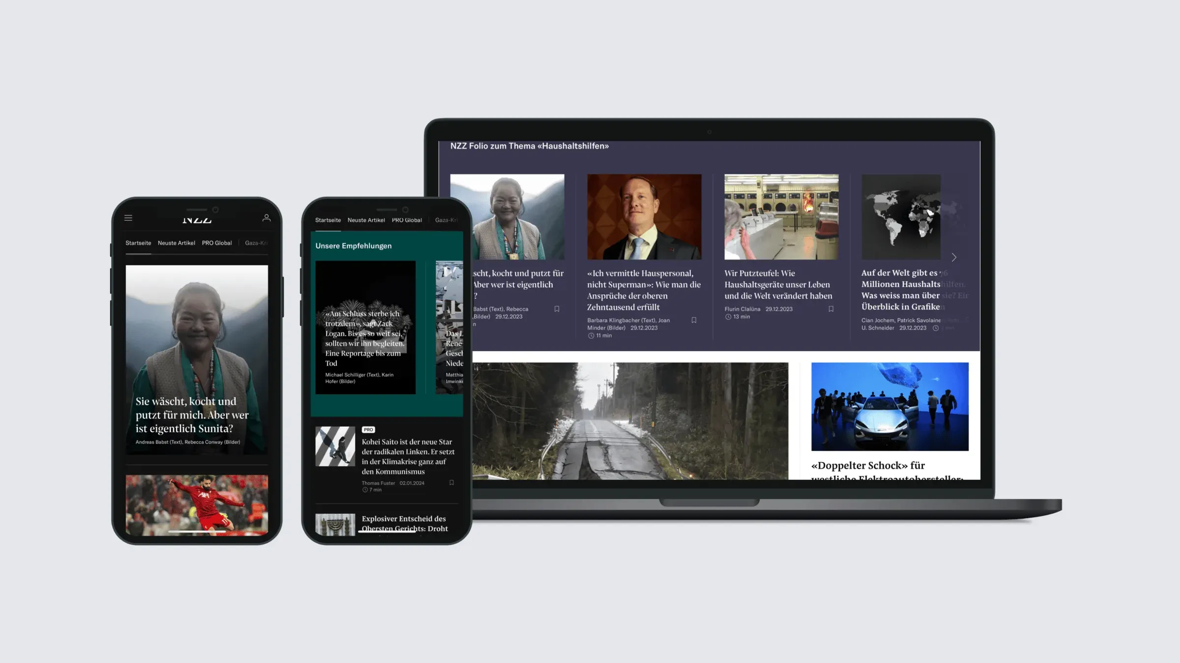
The NZZ planned a new nzz.ch front page, designed for phones first and useful to both readers and the newsroom. The desktop version was meant to follow without the editors doing extra layout work.
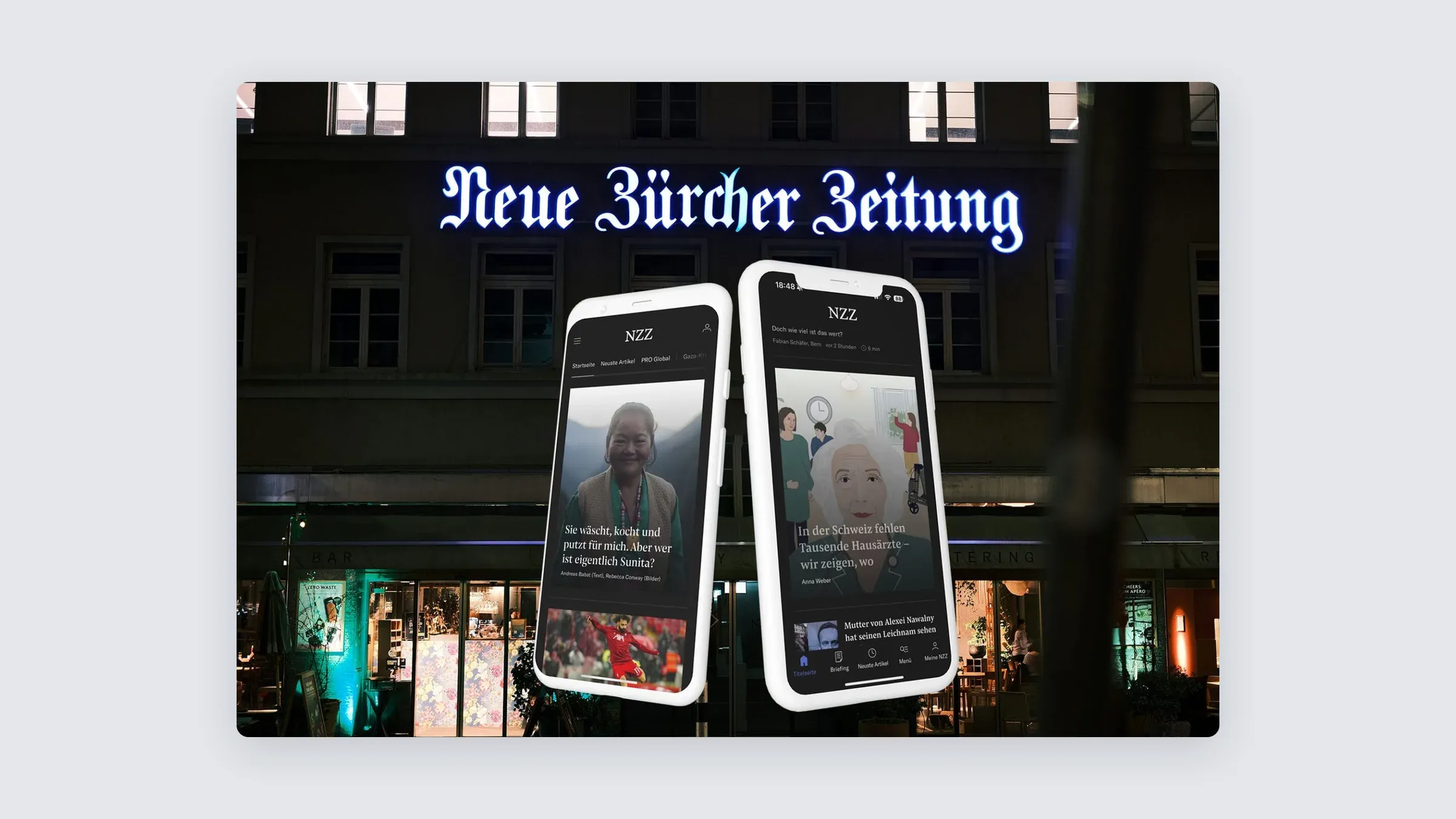
How I contributed
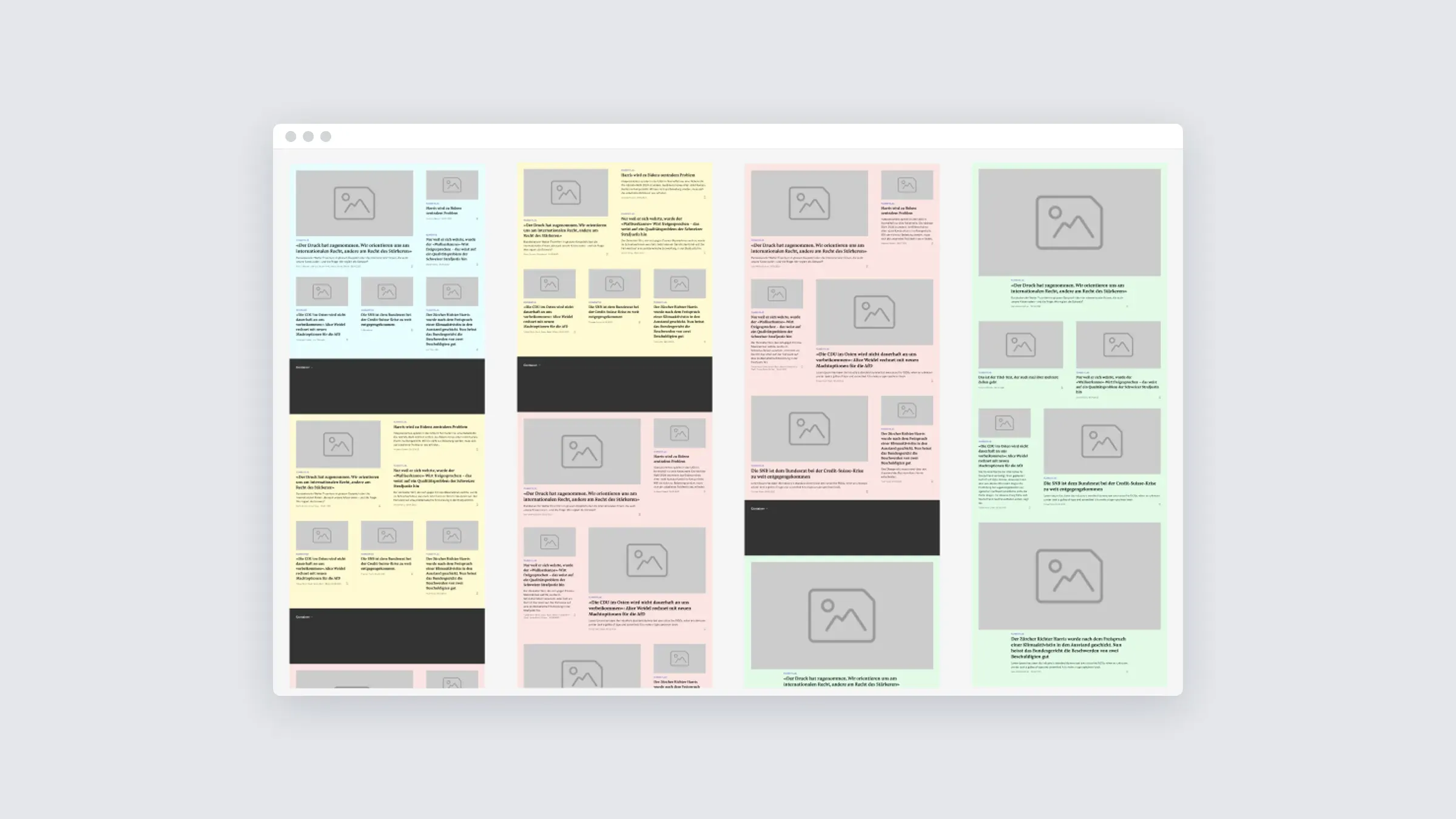
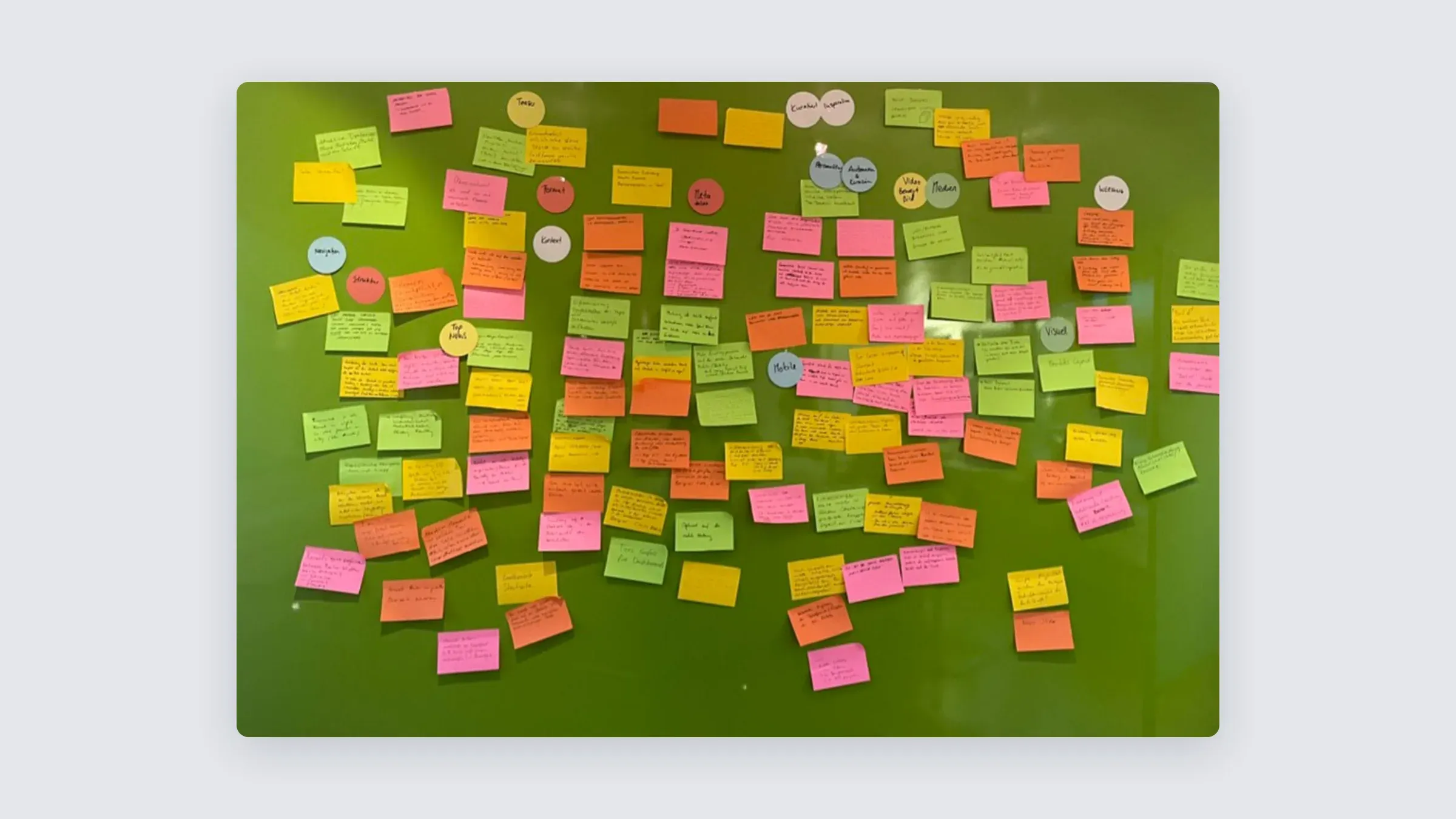
My part covered UX and UI design and the ideas behind it. We began with feedback from readers. After that came two workshops with the editorial team, one for generating ideas and one for mobile-first prototyping.
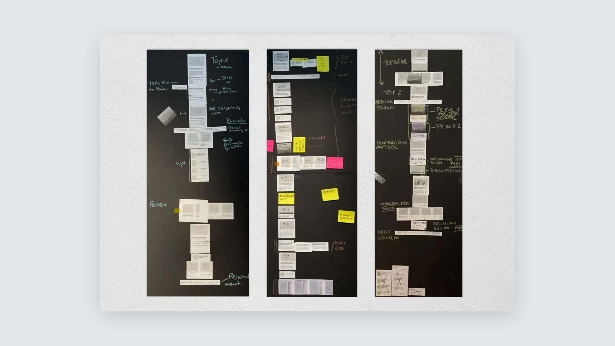
One outcome is a new teaser format for long reads. It takes up the full screen, in dark mode inside the app and in light mode on the web.

The desktop follows
The newsroom now plans for mobile, so the desktop page assembles itself. A solid default layout works for most days. On big news days, editors can still choose special templates.